Video Lesson: Residual Plots
What is a Residual?
A residual is the difference between the observed value and the value predicted by the model at a given data point. A positive residual means that the observed value is above the trendline and a negative residual means it is below the trendline. The larger the residual, the further the point is from the trendline.
In the example below, we see a scatter plot showing 5 data points and its corresponding residual plot.
The green line on the scatter plot is the linear regression line of best fit.
This line on the scatter plot can correspond to the x-axis of the residual plot (also shown in green).
- Any points plotted above the regression line on the scatter plot are above the x-axis of the residual plot. These positive residuals are shown above the axis with a red arrow.
- Any points plotted below the regression line on the scatter plot are below the x-axis of the residual plot. These negative residuals are shown below the axis with a blue arrow.
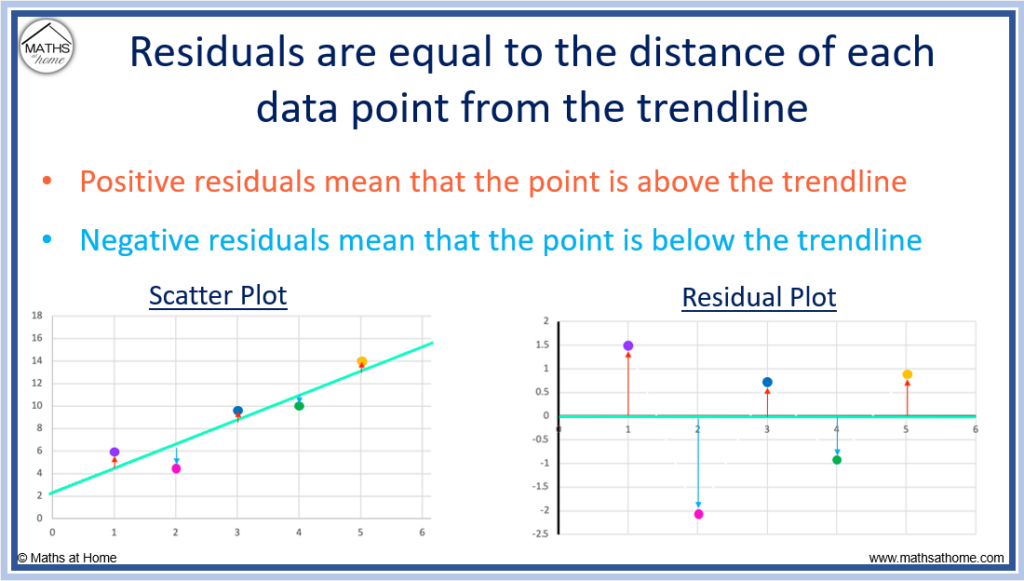
The colour of each data point on the scatter plot shows the corresponding residual on the residual plot.
- The first point (purple) is above the trendline by a distance of 1.5 and so, its residual is 1.5.
- The second point (pink) is below the trendline by a distance of 2.15 and so, its residual is -2.15.
- The third point (blue) is above the trendline by a distance of 0.7 and so, its residual is 0.7.
- The fourth point (green) is below the trendline by a distance of 0.95 and so, its residual is -0.95.
- The fifth point (orange) is above the trendline by a distance of 0.9 and so, its residual is 0.9.
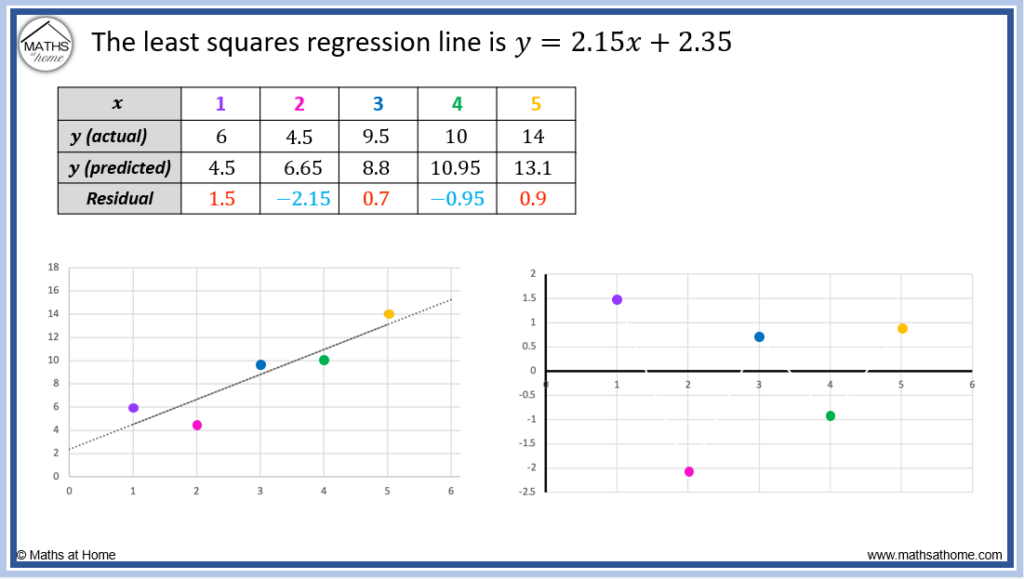
The trendline is a prediction of the y-value at each position. That is the predicted value of y (y-predicted) is found by the height (y-coordinate) of this line at each value of 𝑥.
Since the residual is the difference between the actual point and the trendline, we can say that the formula for calculating each residual is:
Formula for calculating a residual
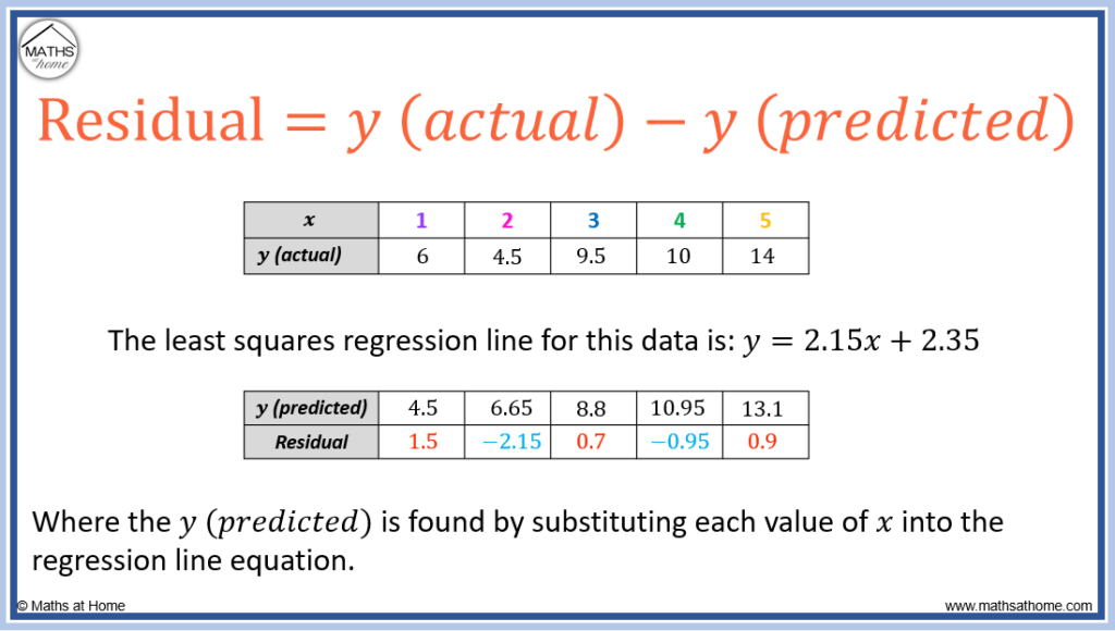
The y (predicted) is calculated in the table above for each value of 𝑥 by using the least squares regression line equation.
- When 𝑥 = 1, the y (predicted) is found using y = 2.15 × 1 + 2.35. We obtain y (predicted) = 4.5
- When 𝑥 = 2, the y (predicted) is found using y = 2.15 × 2 + 2.35. We obtain y (predicted) = 6.65
- When 𝑥 = 3, the y (predicted) is found using y = 2.15 × 3 + 2.35. We obtain y (predicted) = 8.8
- When 𝑥 = 4, the y (predicted) is found using y = 2.15 × 4 + 2.35. We obtain y (predicted) = 10.95
- When 𝑥 = 5, the y (predicted) is found using y = 2.15 × 5 + 2.35. We obtain y (predicted) = 13.1
How to Calculate a Residual
A residual is calculated for each data point using the formula: residual = (actual y value) – (predicted y value). The actual y value is the y value as seen in the data whist the predicted y value is the value obtained from the regression line.
To calculate a residual, we use the formula:
Formula for calculating a residual
- The y (actual) is the value of y (the dependent/response variable) that is given in the table of data. It is also known as the observed value of y.
- The y (predicted) is the value of y that is obtained by substituting the given value of 𝑥 into the regression equation. It is also the height of the regression line at that particular value of 𝑥.

- Calculate the equation of the regression line.
- Substitute each value of 𝑥 into the regression line equation to find each y (predicted).
- Calculate the residuals using the formula: Residuals = y (actual) – y (predicted).
For example, calculate the residuals of the least squares regression line for the data given by:
| 𝑥 | 1 | 2 | 3 | 4 | 5 |
| y | 6 | 4.5 | 9.5 | 10 | 14 |
Step 1. Calculate the equation of the regression line:
The equation of the regression line can be found using an online calculator or using a graphical calculator.
Simply enter the 𝑥 values as List 1 and the y values as List 2.
- Least Squares Regression Line Calculator (also known as Linear Regression)
- Exponential Regression Line Calculator
In this example, we are finding the residual plot for a the least squares regression line.
For this set of data, the equation of the least squares regression line is found to be: .
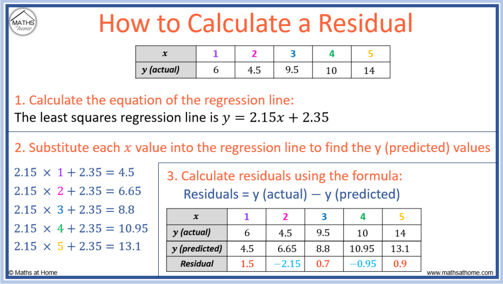
Step 2. Substitute each value of 𝑥 into the regression line equation to find each y (predicted)
The least squares regression equation is .
The equation of this model calculates predicted values of y which are found by substituting each given value of 𝑥 into the equation.
- When 𝑥 = 1, the y (predicted) is found using y = 2.15 × 1 + 2.35. We obtain y (predicted) = 4.5
- When 𝑥 = 2, the y (predicted) is found using y = 2.15 × 2 + 2.35. We obtain y (predicted) = 6.65
- When 𝑥 = 3, the y (predicted) is found using y = 2.15 × 3 + 2.35. We obtain y (predicted) = 8.8
- When 𝑥 = 4, the y (predicted) is found using y = 2.15 × 4 + 2.35. We obtain y (predicted) = 10.95
- When 𝑥 = 5, the y (predicted) is found using y = 2.15 × 5 + 2.35. We obtain y (predicted) = 13.1
Step 3. Calculate the residuals using the formula: Residuals = y (actual) – y (predicted)
For each column in the table, we subtract the y (predicted) from the y(actual) to obtain the residual for that given value of 𝑥.
- For 𝑥 = 1, the residual = 6 – 4.5 = 1.5
- For 𝑥 = 2, the residual = 4.5 – 6.65 = -2.15
- For 𝑥 = 3, the residual = 9.5 – 8.8 = 1.5
- For 𝑥 = 4, the residual = 10 – 10.95 = -0.95
- For 𝑥 = 5, the residual = 14 – 13.1 = 0.9

How to Make a Residual Plot
A residual plot is a graph in which the residuals are plotted on the y-axis and the 𝑥 values (of the independent/explanatory variable) are displayed on the 𝑥-axis.
To make a residual plot:
- Calculate the residuals for each data point using residual = actual y – predicted y.
- Plot the residual on the y-axis for each given value of x.
For the bivariate data given by:
| 𝑥 | 1 | 2 | 3 | 4 | 5 |
| y | 6 | 4.5 | 9.5 | 10 | 14 |
We can calculate the residuals to be:
| 𝑥 | 1 | 2 | 3 | 4 | 5 |
| Residuals | 1.5 | -2.15 | 0.7 | -0.95 | 0.9 |
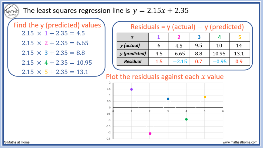
The process for calculating these residuals is shown in the ‘How to Calculate Residuals’ section above and is summarised in the images below.
A residual plot displays the 𝑥 values on the 𝑥-axis, with the residuals plotted on the y-axis.
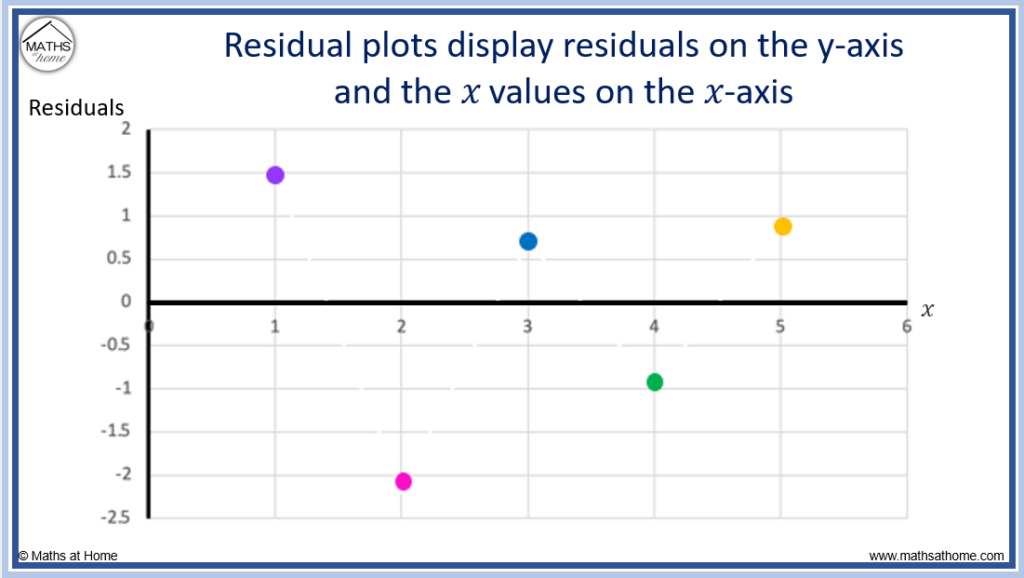
Here is the full process of calculating the residuals from the list of data and then plotting the residual plot.
Here is another example of how to calculate the residuals for a set of data and then display the results in a residual plot.
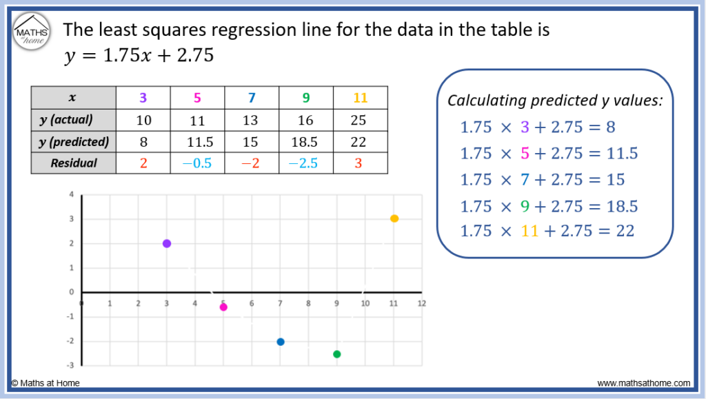
We will calculate the residuals for the least squares regression line (linear regression) for the following set of data:
| 𝑥 | 3 | 5 | 7 | 9 | 11 |
| y | 10 | 11 | 13 | 16 | 25 |
The least squares regression equation is found to be .
We substitute each value of 𝑥 into this equation to obtain the predicted y values:
- When 𝑥 = 3, the y (predicted) is found using y = 1.75 × 3 + 2.75. We obtain y (predicted) = 8
- When 𝑥 = 5, the y (predicted) is found using y = 1.75 × 5 + 2.75. We obtain y (predicted) = 11.5
- When 𝑥 = 7, the y (predicted) is found using y = 1.75 × 7 + 2.75. We obtain y (predicted) = 15
- When 𝑥 = 9, the y (predicted) is found using y = 1.75 × 9 + 2.75. We obtain y (predicted) = 18.5
- When 𝑥 = 11, the y (predicted) is found using y = 1.75 × 11 + 2.75. We obtain y (predicted) = 22
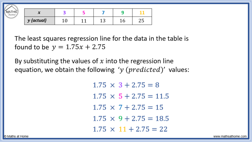
The residuals are calculated for each 𝑥 value using the formula: Residual = y (actual) – y (predicted).
- For 𝑥 = 3, the residual = 10 – 8 = 2
- For 𝑥 = 5, the residual = 11 – 11.5 = -0.5
- For 𝑥 = 7, the residual = 13 – 15 = -2
- For 𝑥 = 9, the residual = 16 – 18.5 = -2.5
- For 𝑥 = 11, the residual = 25 – 22 = 3
These residuals are plotted on the y-axis against each 𝑥 value on the 𝑥-axis to form the residual plot.
How to Make a Residual Plot on a Calculator
The easiest way to produce a residual plot from two lists of data is to use a graphical calculator.
The steps below show how to produce a residual plot using two common graphical calculators, the Ti84 Plus and the Casio
How to Make a Residual Plot on a Ti-84 Calculator
To make a residual plot on a Ti84 Calculator:
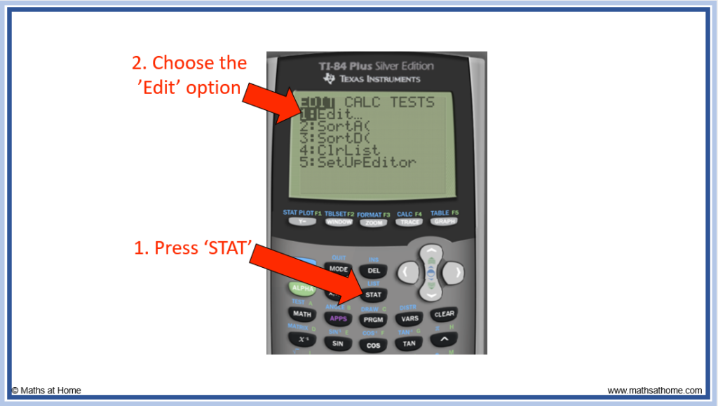
- Press ‘STAT’ to bring up the statistics menu and press ‘1’ for edit.
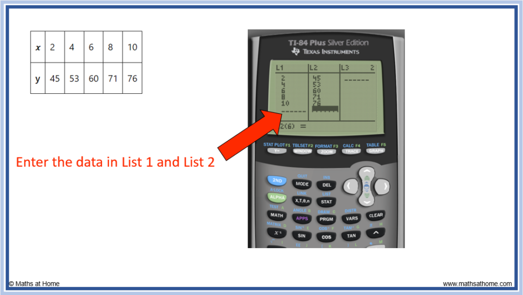
- Enter the two lists of data as List 1 and List 2.
- Perform regression (linear or exponential) with the data.
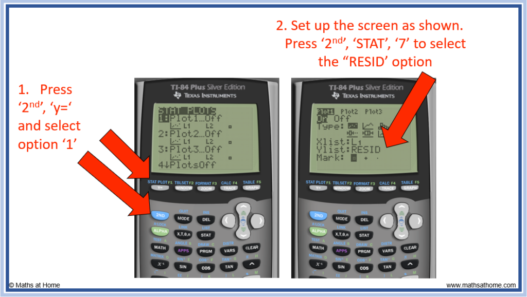
- Press ‘2nd’, ‘y=’ (stat plot), ‘1’ (plot 1) and then set the YList as RESID.
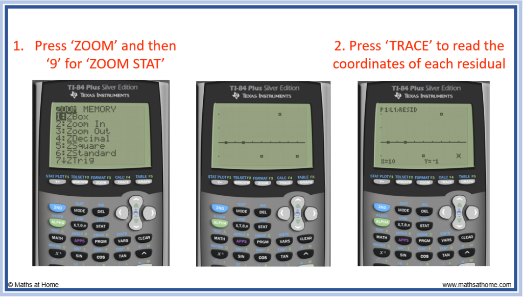
- Press ‘Zoom’ ‘9’ (Zoom Stat) to see the residual plot.
- Press ‘TRACE’ to read the different residual coordinates using the arrows.
For example, use the Ti84 calculator to make a residual plot for the data:
| 𝑥 | 2 | 4 | 6 | 8 | 10 |
| y | 45 | 53 | 60 | 71 | 76 |
Step 1. Press ‘STAT’ to bring up the statistics menu and press ‘1’ for edit
Step 2. Enter the two lists of data as List 1 and List 2
We have the data:
| 𝑥 | 2 | 4 | 6 | 8 | 10 |
| y | 45 | 53 | 60 | 71 | 76 |
We enter the 𝑥 values as List 1 and the y values as List 2.
Step 3. Perform regression (linear or exponential) with the data

Step 4. Press ‘2nd’, ‘y=’ (stat plot), ‘1’ (plot 1) and then set the YList as RESID
By pressing ‘2nd’, ‘y=’, the ‘STAT PLOT’ screen is shown.
From this screen, press ‘1’ to select the Plot 1.
The following screen must be set up as shown in the image below.
The YList must be set to RESID. In order to select the RESID option, press ‘2nd’, ‘STAT’ and then select RESID from the choices shown (option 7).
Step 5. Press ‘Zoom’ ‘9’ (Zoom Stat) to see the residual plot
To read each residual coordinate, press the ‘TRACE’ button.
Use the arrow keys to move between each residual.
How to Make a Residual Plot on a Casio Calculator
To make a residual plot on a Casio calculator:
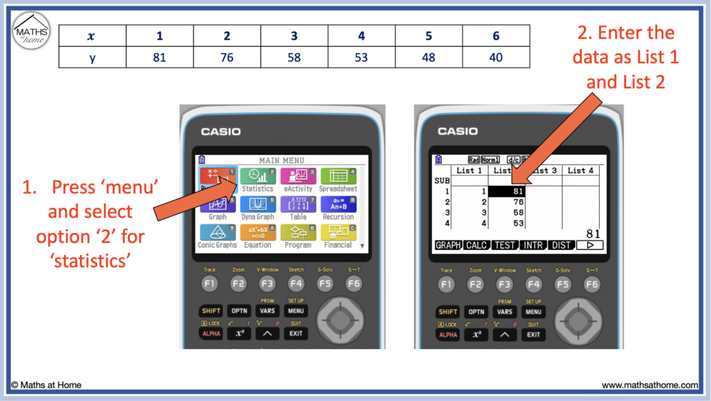
- Press ‘menu’ and then select the statistics option by pressing ‘2’.
- Enter the two lists of data as List 1 and List 2.
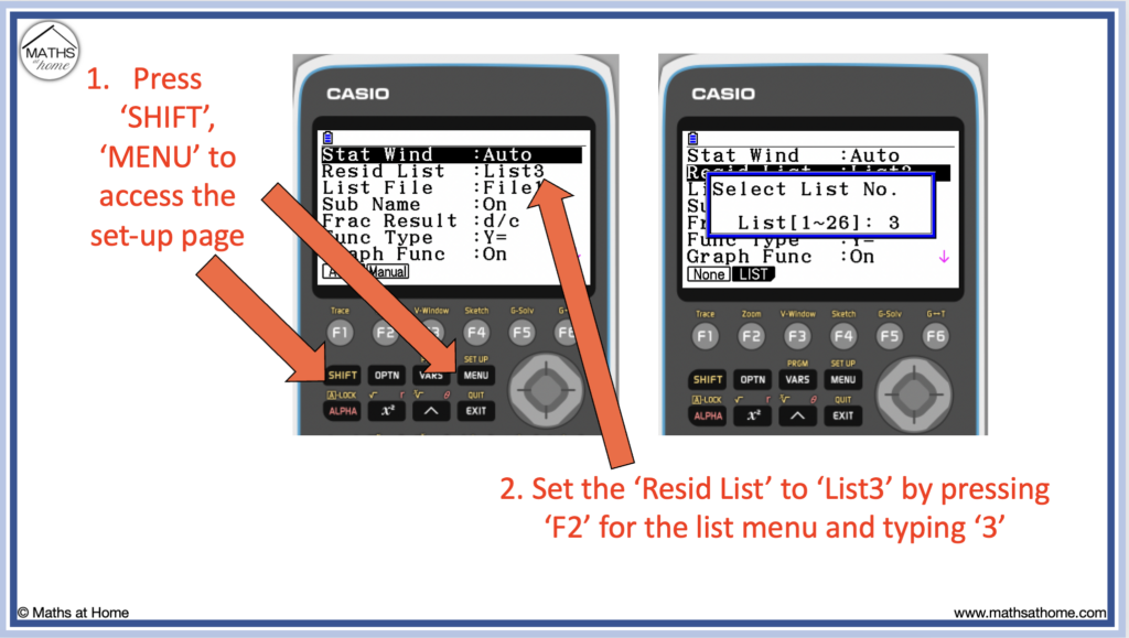
- Press ‘shift’, ‘menu’ (set up) and set the Resid List as ‘List3’. Press ‘exit’.
- Perform regression (linear or exponential) with the data.
- ‘Press ‘exit’ four times, press ‘F1’ (GRAPH), ‘F6’ (SET) and set the XLIST as ‘List1’ and the YLIST as ‘List3’.
- Press ‘exit’ then ‘F1’ (graph) to see the residual plot.
For example, create a residual plot using a Casio graphical calculator for the following data:
| 𝑥 | 1 | 2 | 3 | 4 | 5 | 6 |
| y | 81 | 76 | 58 | 53 | 48 | 40 |
Step 1. Press ‘menu’ and then select the statistics option by pressing ‘2’
Step 2. Enter the two lists of data as List 1 and List 2
The 𝑥 (independent variable) values are written as List 1 and the y (dependent variable) values are written as List 2.
Step 3. Press ‘shift’, ‘menu’ (set up) and set the Resid List as ‘List3’. Press ‘exit’
The residuals will be stored in List 3 once they are calculated.
To change the list to ‘List 3’ use the arrows to go down to Resid List and then press ‘F2’ to bring up a box in which the number ‘3’ should be typed’. Then press ‘exe’.
Step 4. Perform regression (linear or exponential) with the data
From the set-up menu in the previous step, simply press ‘exit’ to return to the main statistics menu where the two lists of data can be seen.
Alternatively, press ‘menu’, ‘2’ to return to this page.
Complete linear regression for the two data sets by pressing:
- F2 for CALC
- F3 for REG
- F1 for X
- F1 for ax+b
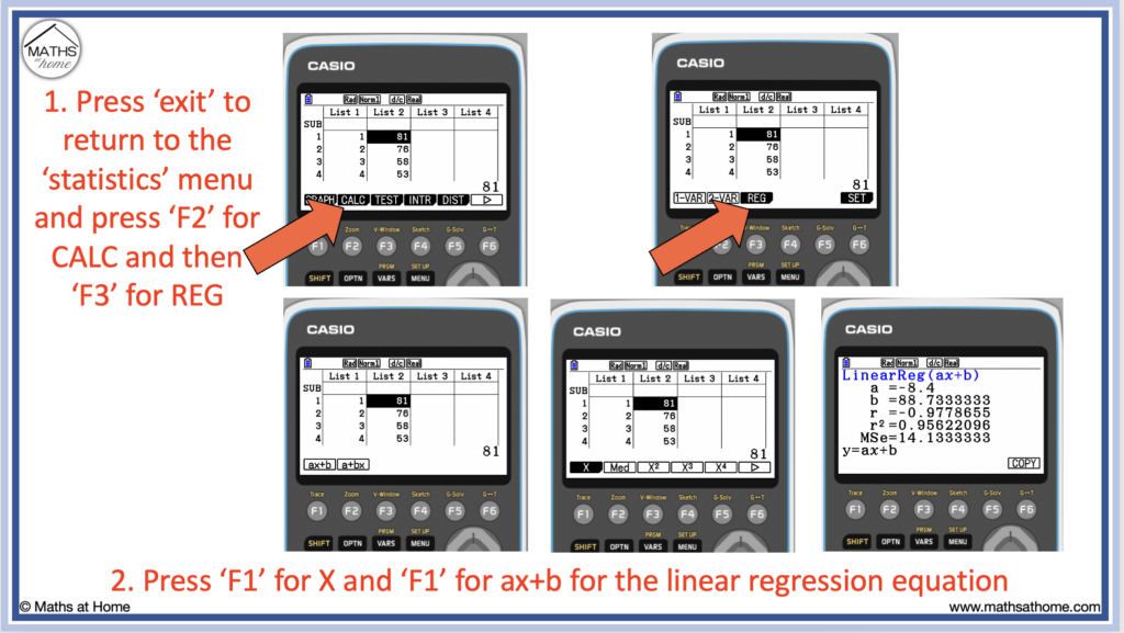
The values of a and b calculated on this screen tell us that linear regression have been calculated.
In this example, a=-8.4 and b=88.7, therefore the linear regression equation is y = -8.4𝑥 + 88.7.
Step 5. ‘Press ‘exit’ four times, press ‘F1’ (GRAPH), ‘F6’ (SET) and set the XLIST as ‘List1’ and the YLIST as ‘List3’
Pressing ‘exit’ four times will take us back to the main statistics screen. Alternatively, we can press ‘menu’, ‘2’.
This time we see three lists of data.
The first two lists of data are our original two lists that we entered.
The third list of data in List 3 are the residuals that have now been calculated.
If you did not require a residual plot and simply wanted to calculate the numerical values of each residual, you can read these values off from List 3 now.
To create the residual plot, press:
- F1 for GRAPH
- F6 for SET
Then change the YList to List3 by going down to YList and pressing F2 to bring up the list menu. Enter a ‘3’ here and press ‘exe’.
Step 6. Press ‘exit’ then ‘F1’ (graph) to see the residual plot
Press ‘exit’ to return to the main statistics menu showing the three lists and then press ‘F1’ (Graph) and then ‘F1’ (GRAPH 1) to graph the residual plot.
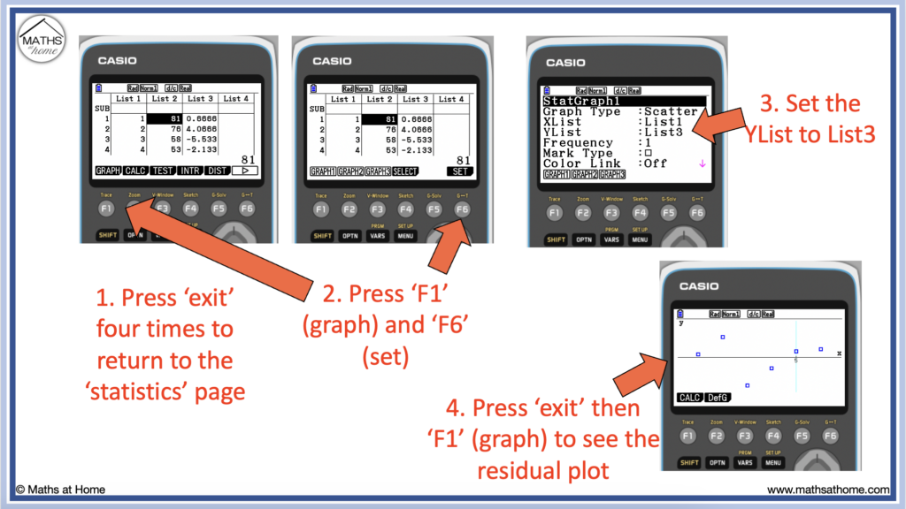
Press ‘SHIFT’ ‘F1’ (TRACE) to show the coordinates of each residual and use the arrow keys to move from one to the other.
What is a Residual Plot?
A residual plot is a graph of the residuals against the given x values. Positive residuals indicate points that are greater than the prediction of the model and negative residuals indicate points that are below the prediction of the model. Residual plots are used to identify trends in data and to ascertain if a model is an appropriate fit for the data.
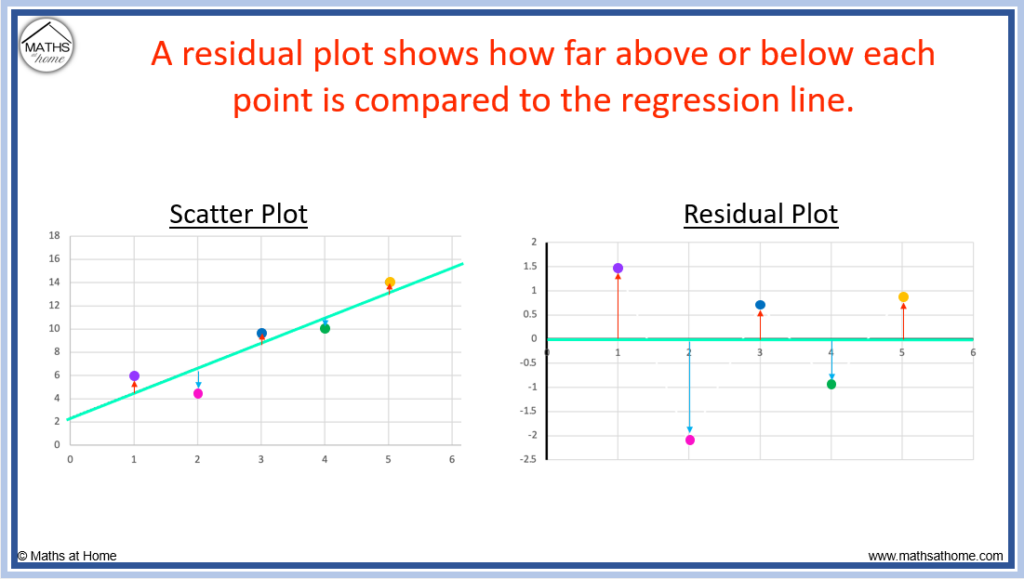
A residual plot displays the residuals on the vertical axis and the 𝑥 values on the horizontal axis.
Residual plots are used to better observe trends in data. They are useful for identifying if the regression equation used is an appropriate fit for the data or not.
Outliers can be identified from residual plots by noting which points have the largest residual values.
How to Interpret Residual Plots
If the residuals are small, randomly scattered and have a similar number of points above and below the x-axis, then the model used is likely to be a good fit for the data. If the residuals are large or show a clear pattern, then the model is likely not a good fit. If there is a clear curved pattern in the residuals, a linear model is not appropriate.
Residual plots are used to indicate trends in data which may not be as obvious on a scatter plot.
Residual plots magnify the differences seen between the position of each point and the trendline and so, patterns in the data can be more evident.
Therefore, residual plots are used to decide if the regression line used is an appropriate fit for the data or not.
A model is a good fit if the residual plot shows no clear pattern
The regression line is an appropriate model for the data if:
- The residuals are small
- The residuals are randomly scattered with no clear pattern
- There are a similar number of points above and below the axis
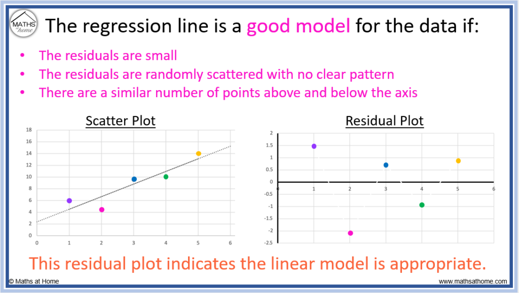
The example residual plot above indicates that the model used is an appropriate fit for the data. This is because there is no clear pattern to the residuals and they are not too far from the axis.
We can see in the scatter plot that the points lie close to the trendline.
A model is not a good fit for the data if the residual plot shows a clear pattern
The regression line is not appropriate if:
- The residuals are large
- There is a clear curved pattern in the residuals
- Most of the points lie above or below the axis
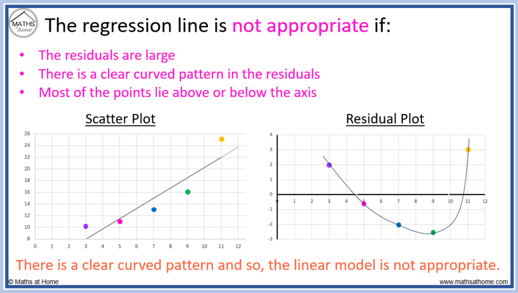
At first sight, the linear trendline on the scatterplot may seem appropriate as it passes through the middle of the datapoints.
However, the residual plot shows the curved pattern to the data more clearly.
We can see the curved pattern to the data on the scatter plot itself but it may not be as obvious as on the residual plot.
We can also see that some of the residuals are a bit larger and this means that these points are further from the trendline and do not fit the data.
Since the model used is a linear trendline, any curved pattern to the data is deemed inappropriate.
We see in the image below, two curved patterns that indicate that the linear model is not appropriate.
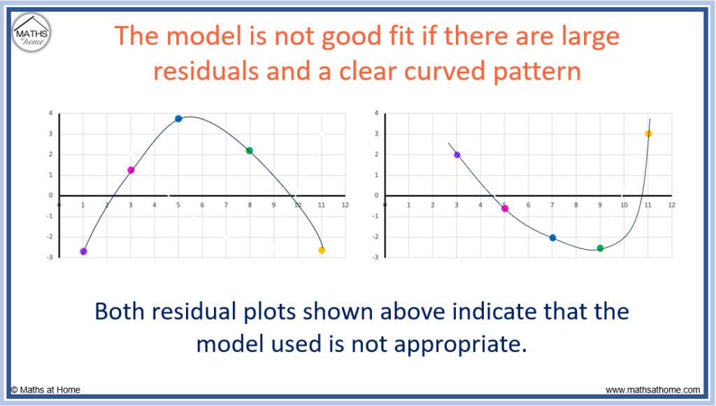
A linear model is not appropriate if there is a clear curved ‘u’ or ‘n’ shaped pattern in the residuals.
Overall, a residual plot indicates that the model used for the data is good if there is no pattern. A residual plot containing a curved pattern indicates that the model may be inappropriate and a better model can be found.
If a clear curved pattern is found on the residual plot for a linear regression trendline, an exponential regression model may be more appropriate for the data
no pattern
How to Make a Residual Plot in Excel
A residual plot can be made in excel using the following steps:
- Enter the data in two columns
- Select the data and insert a scatterplot
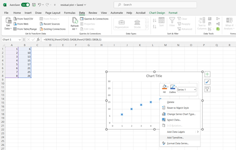
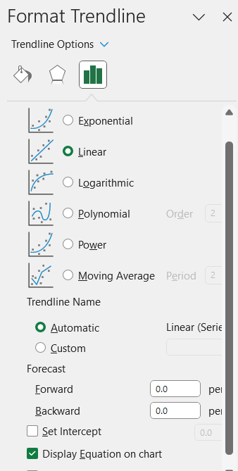
- Add a trendline and display the equation
- Use this equation to calculate predicted y-values using the given x-values
- Calculate the residuals by subtracting the predicted y-values from the given y-values
- Select the x-values and residuals and insert a scatterplot
For example, we will create a residual plot for the data:
| 𝑥 | 1 | 2 | 3 | 4 | 5 | 6 | 7 | 8 |
| y | 6 | 10 | 13 | 15 | 17 | 21 | 25 | 26 |
Step 1. Enter the two lists of data in two columns
We can enter the 𝑥 list in column A (cells A1:A8).
We can enter the y list in column B (cells B1:B8).
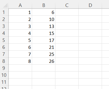
Step 2. Select the data and insert a scatterplot
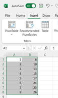
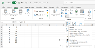
Click on insert from the top toolbar and then click on the ‘Scatter’ option from the charts list as shown.
Step 3. Add a trendline and display its equation
Step 4. Use this equation to calculate predicted y-values using the given x-values
The equation displayed on the chart is the regression line.
This will be used to calculate predicted y values in this step.
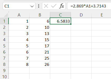
The linear regression equation in this example is given by excel as .
We will represent this on Excel using the formula ‘=2.869*A1+3.7143’.
We need to start the equation with an equals sign and we need to use the asterisk symbol ‘*’ for the multiplication.
We are substituting the 𝑥 values in column A, so we replace 𝑥 in the equation with A1, which contains the first 𝑥 value.
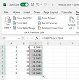
Column C now contains the list of predicted y values.
Step 5. Calculate the residuals by subtracting the predicted y-values from the given y-values
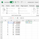
The residuals are equal to the actual y values that are given in column B subtract the predicted y values we calculated in column C.
In cell E1 we type ‘=B1-C1’ this will calculate the residual for the first data point.
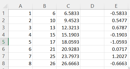
This column now contains all of the residual values.
Step 6. Select the x-values and residuals and insert a scatterplot
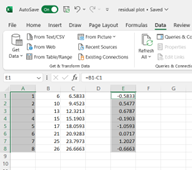
Hold the Ctrl button in order to select two columns like this.
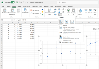
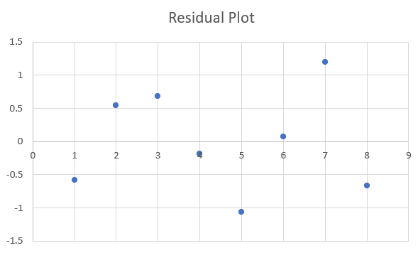
The produced residual plot is shown below.
